
Introduction
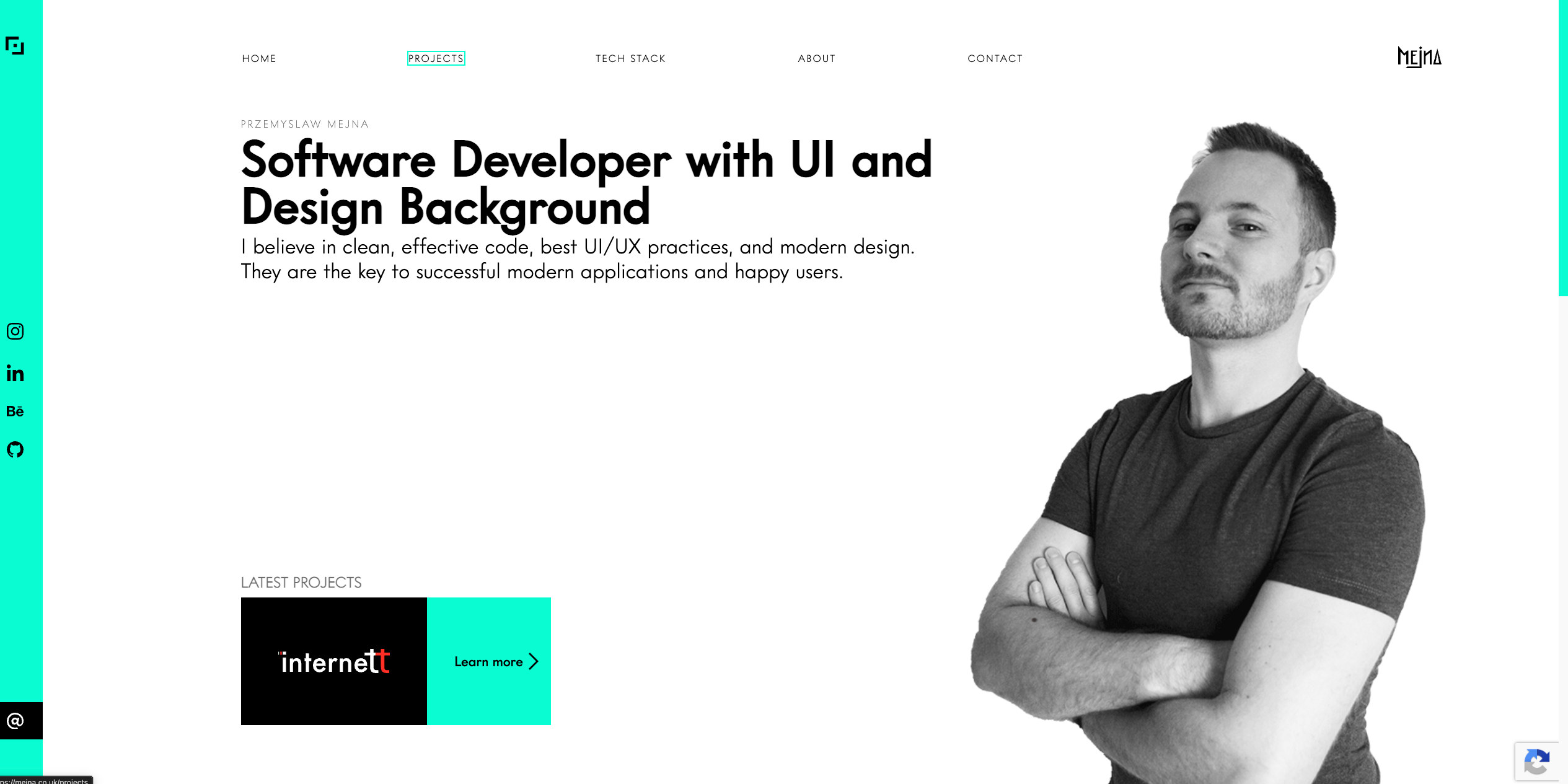
There comes a moment for anyone with a personal website when you realize the page is outdated in more ways than one. The design feels old, and the message no longer reflects who you are or what you do.
We gain experience, learn new things, shift direction, and change how we see the field we work in. Our websites don't necessarily keep up.
That happened to me a year or two ago. I cringed every time I looked at my page, but there never seemed to be time for a proper redesign. Despite being a full-stack engineer with a background in design and illustration, I kept putting my own website off.
Maybe I was busy. Maybe I was procrastinating more than I wanted to admit. Probably a bit of both. 😅
I had been using AI almost daily since the early days of ChatGPT, back when our Stable Diffusion experiments were producing seven-fingered monstrosities. Even so, spending my time and tokens on a personal website hadn't felt like a priority.
The first redesign attempts came in June, before VPES. Working on that prototype workflow later gave me a reason to return: I had a process to test and a neglected website to test it on.
I was already comfortable writing detailed visual prompts. This experiment was about adapting them to a multi-stage workflow, where one image had to inform the next decision. Those lessons are now shaping Visual System Skills (VSS), my upcoming AI skills project.
The idea behind VPES
VPES stood for Visual Product Expansion System (just my codename). The idea was to start with a visual direction, explore it through generated images, and develop it into the assets, sections and working code a website needed.
A visual reference could show layout balance, typographic weight and the relationship between illustration and empty space. VPES would generate four options at each stage, let me select one or request another batch, and carry the approved reference forward.
Specialized skills handled direction, design-system boards, assets and page designs. A CLI tracked outputs, dependencies and approvals. The “design system” at this stage was an image of common components, not a coded library.
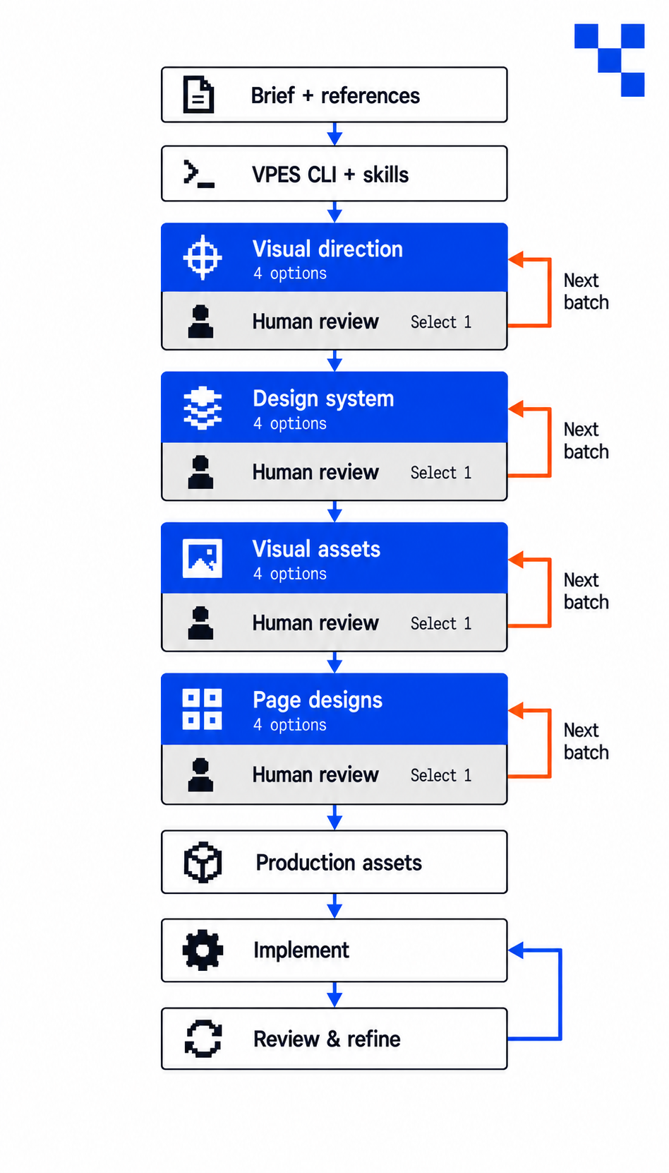
That coupling made individual skills harder to reuse: they depended on the CLI and its expected project structure. VSS moves toward skills with a clear job that can work independently or together. Its parts still share references, but I want less machinery between a useful skill and the work.
June: before VPES
One of my earliest messages to Codex about the first attempts was:
still ugly - can you make for me condensed homepage wireframe doc?
I wanted the structure stripped out so I could try the design somewhere else. Shortly afterwards, I added: “only structure.”
The first problem was purpose. I wanted to share my work, interests and experiments as an engineer with a design background. I wasn’t seeking freelance work, and I couldn’t show named client projects. Yet the site kept returning to skills, proof, services and a contact pitch.
Even after explaining that, I got sections about how the platform was organized, a “Current Focus” block in the hero, and “Proof” copy that felt like it was demanding attention. My response was blunt: “W$%# are you doing you..." 😅
The visual problems were just as immediate. Sections felt crammed. Typography was too heavy. Side padding went missing. The footer didn't resemble the reference. I could see parts getting closer—the hero, the second section—but the whole page wasn't coming together.
This became a recurring difficulty: the agent could respond to a correction locally without holding onto the intention behind it across the rest of the page.
July: something useful to argue about
The visual exploration started becoming more productive when I asked for stylescapes: boards showing how typography, color, imagery and graphic elements could belong together.
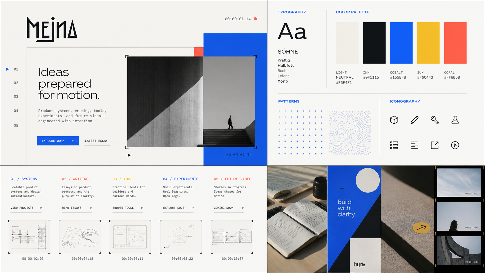
We generated sixteen candidates across four batches. I selected a direction called Daylight Cinema as the provisional reference. From there, we explored assets, editorial treatments and tall page layouts. I liked elements from three editorial boards and chose a page composition called Cinematic Lead.
Three examples from the first July batch show the range we explored with VPES.
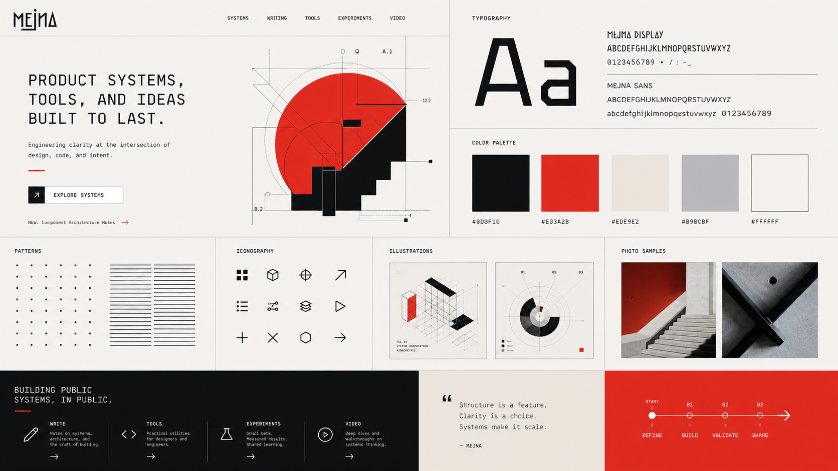
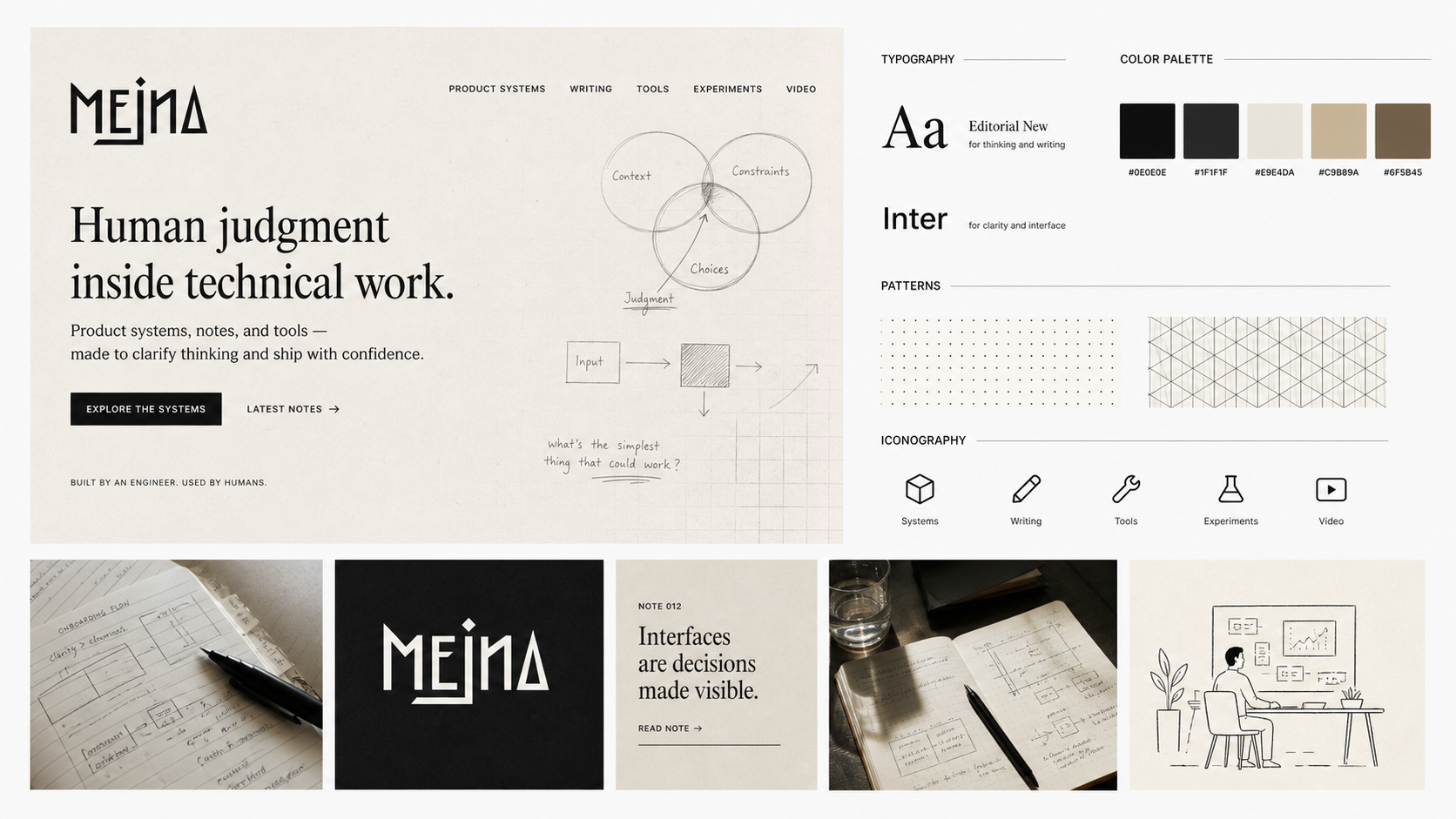
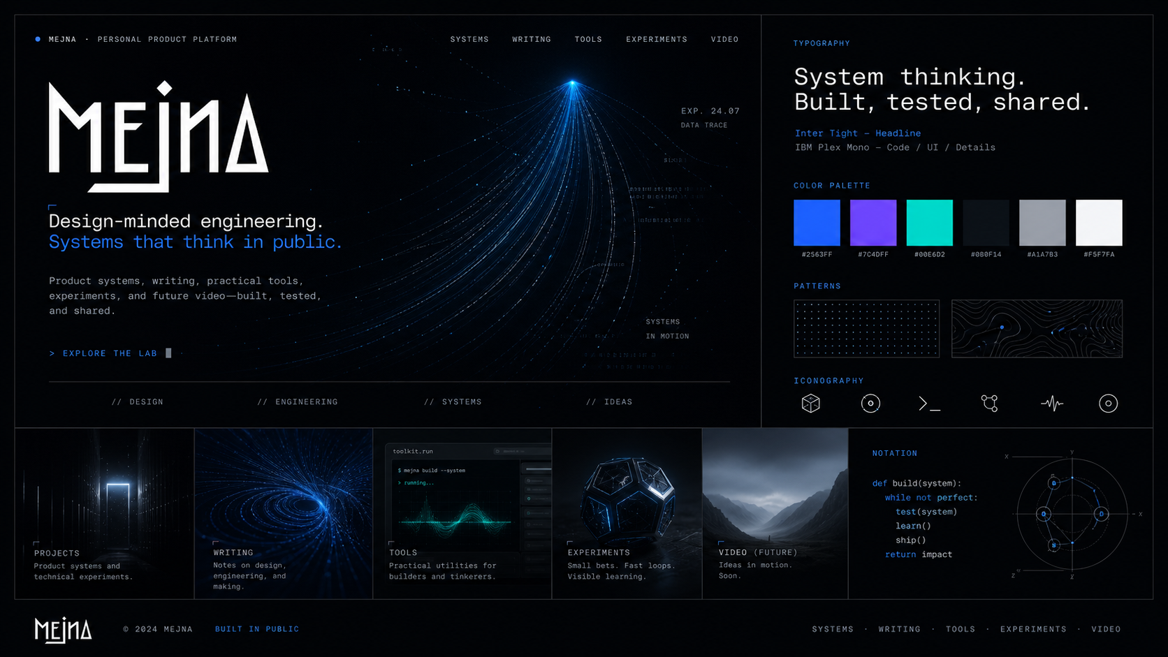
The images gave me something specific to react to: keep that shape, this is too dark, explore this further—or simply “WTF?”. They made comparison easier than the text-only website requests I had tried, even with a brand/design.md file.
There is a temptation to tell this story as “we generated too many options.” But I was the person repeatedly asking for four more. Some of those batches helped me discover what I wanted.
The difficulty was deciding what kind of variation I needed. Early on, different visual worlds were useful. Later, once I liked a direction, I wanted different compositions within it. Changing the entire style at that point meant losing progress.
 Open original image (opens in a new tab)
Implementation introduced a different problem: fidelity.
A preferred hero shape became a different shape. A pattern needed to be generated at a useful resolution rather than enlarged from a small board. I had to explain that the shaped photograph and the background pattern were separate assets. I even had to remind the agent that the hero background should be white.
August: ships and lighthouses
In August, with roughly 80% of the page done, I reopened the direction. Further experiments had made familiar patterns hard to ignore: minimalism repeatedly brought concrete buildings; material prompts brought predictable texture boards. I suspected my keyword choices were steering those associations. That was a pattern in my results, not a diagnosis of the model.
I still wanted modern, minimal work with contrast and character. Swiss typography and dithering appealed to me, but some outputs blended into darkness and others became too white. I wanted more imagination than a collection of abstract objects.
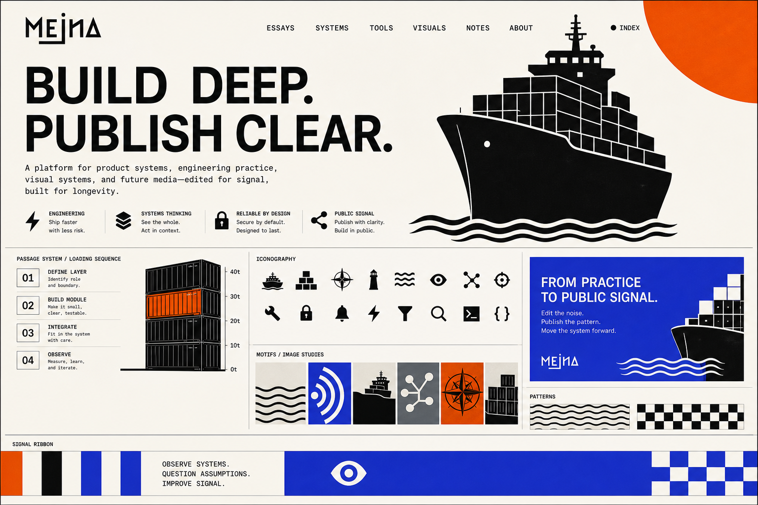
I revised the VPES prompts, and the exploration moved toward illustrated shipping imagery.
That theme gave me something to work with. Shipping software is an obvious wordplay, but the surrounding elements opened up other possibilities: containers as building blocks, a lighthouse suggesting curiosity or discovery, movement across water. It could connect engineering with illustration without showing a fake product screen.
I didn't want every sentence to become a nautical joke, though "I SHIP products" 😅. The visual language needed to work beyond boats, and the copy needed more restraint.
I refined the cargo direction. I selected parts: a white hero, a blue card, particular decorative elements. The board eventually approved as the new reference was called Passage System.
 Open original image (opens in a new tab)
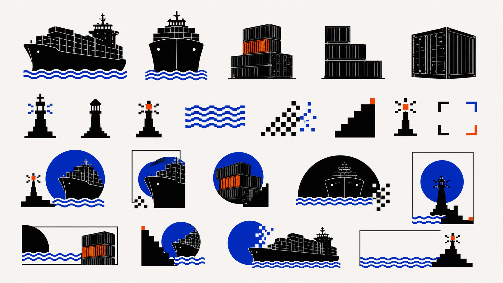
The assets became more interesting when we mixed minimal geometric illustration with pixel art. I liked the cleaner treatment of the ship and containers, but also the rougher pixel language of the signals and lighthouse.
One message captures an uncomplicated good moment:
love this lighthouse btw - looks amazing
That was something worth keeping. The task now was to build around it without turning every section into another illustrated scene.
Three different kinds of failure
Prompt failures showed up when an asset request produced another stylescape: labels, buttons, typography samples and palette displays. The prompt was still asking for a presentation of the style. I had to specify usable artwork: apply the palette, don’t display it; include texture only when the direction calls for it.
Implementation failures came after a reference was selected.
Then came the production assets. The agent reconstructed selected artwork as SVGs. The files were scalable and technically valid. They also changed the character of the images I had chosen.
The SVGs are not pixel perfect, are too inaccurate
For those assets, I wanted the selected raster artwork preserved. Cropping and lossless export could keep the pixels we had chosen. Regeneration or recoloring could change them; JPEG export could also introduce compression loss. A similar vector drawing wasn’t a substitute for the approved image.
That instruction led to another mistake: during implementation, the agent replaced my existing logo with a text approximation. It had interpreted “don't use SVGs” so broadly that it changed an established brand asset. Restoring it then required another correction because the replacement image wasn't properly transparent.
Workflow failures concerned what the agent did next. While I was still asking for visual page variants, Codex started changing the website. It confused the existing page, which supplied the structure, with the new references, which supplied the style. I had to ask for changes to be undone and the baseline captured again.
I was frustrated, and some of my messages were harsher than they needed to be 💀.
Those were different problems. Better wording could improve the asset batch; explicit approval boundaries could stop premature implementation; visual comparison was needed to catch inaccurate artwork.
The Practice Log detour
The middle of the homepage was hardest to resolve. To describe work I couldn’t show, the agent proposed reconstructed evidence: diagrams and artifacts demonstrating engineering responsibilities. I approved intermediate choices, then found myself asking what they were for and where they belonged.
Eventually I asked:
Why are we doing the case studies of things we cannot show???
I needed broad responsibilities supported by illustrations, not invented project evidence. Three professional domains made the content clearer, but the presentation still felt like a CV.
Codex made a useful suggestion here: frame the section as a Practice Log. Describe the work as something that moves across interfaces, shared systems and internal tools. That was closer.
I then suggested a desktop composition with two text areas above and a third centered below, making a loose V. Decorative elements could sit around the sides and bottom. We reached the wireframe that prompted my “Let's GOOOOOO!!!!” response.
Then the styled version arrived, and I disliked it enough to start a new chat.
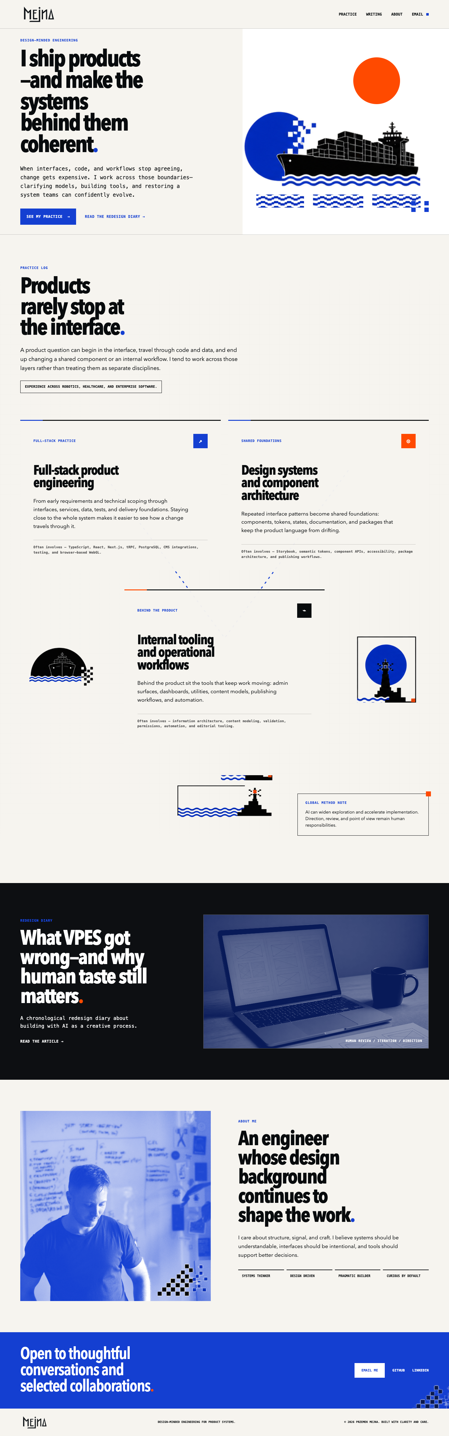
The arrangement worked as a wireframe. Its visual treatment still needed judgment.
The section needed further visual work: quieter typography, less illustrative clutter, a shallower descent at the sides, and black space before the dark article section. That black space mattered. I wanted a pause between the scenes, rather than one illustration immediately colliding with another.
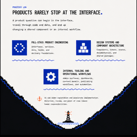
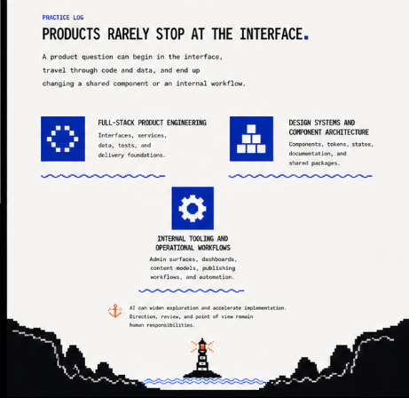
By this point, my instructions were increasingly spatial. Keep these sections. Replace this one. Make the sides shallower. Leave black space here. The style adjectives had already done their job; now we needed to get the relationships right.
The selected page design brought those pieces together: the ship and red sun in the hero, the Practice Log, the lighthouse between the cliffs, and the dark article scene below. This was the visual reference we carried into the September implementation.
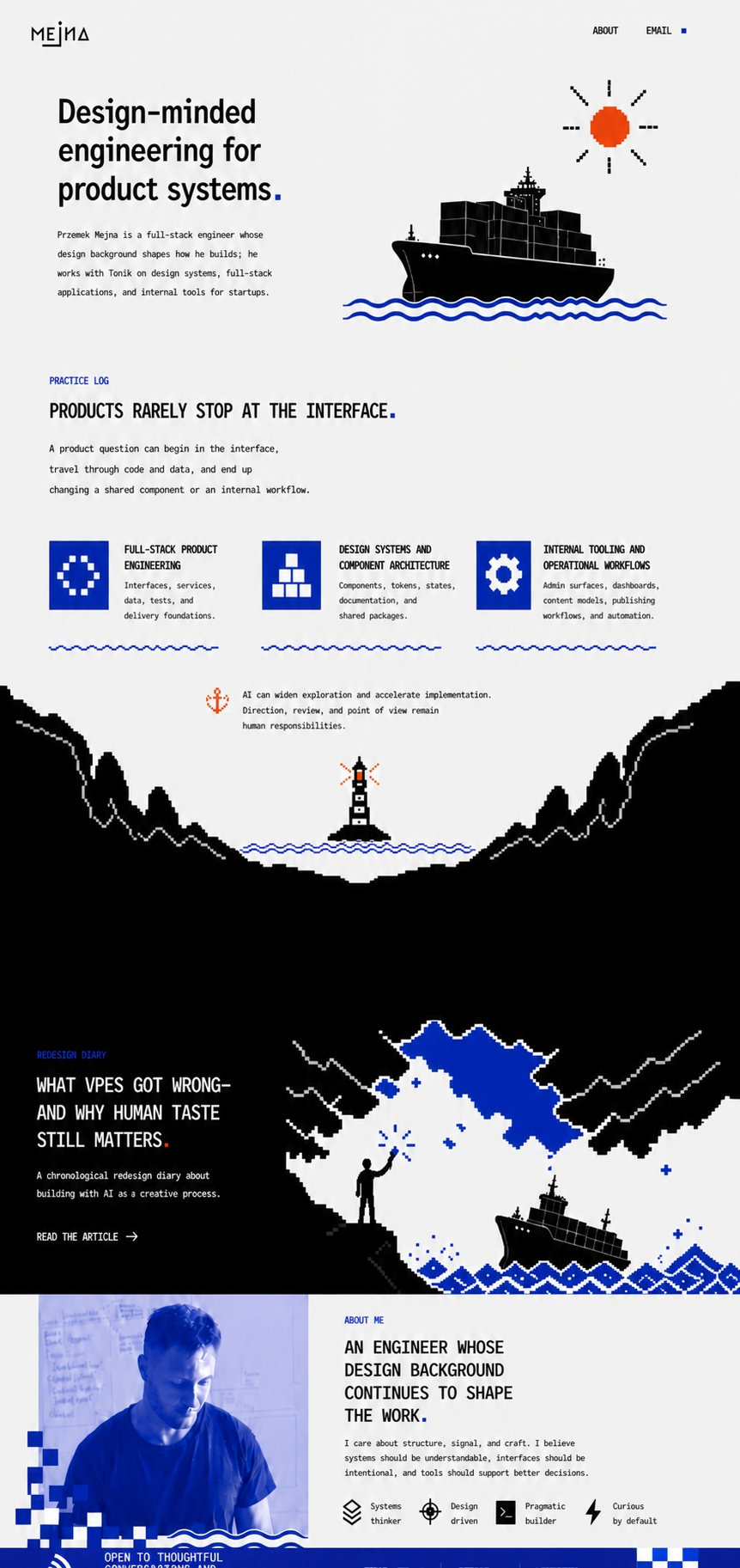
September: making the scene move
Motion brought another round of frustration, but also some of the most enjoyable results.
The visual language gave us things to animate: the sun, the ship, water, a lighthouse beam, a figure holding a red torch. These were specific ideas we could develop within a style I already liked.
I also used my own produce-frame-animation skill for the frame-by-frame animation work. It gave that part of the process a dedicated workflow alongside the page design and implementation skills.
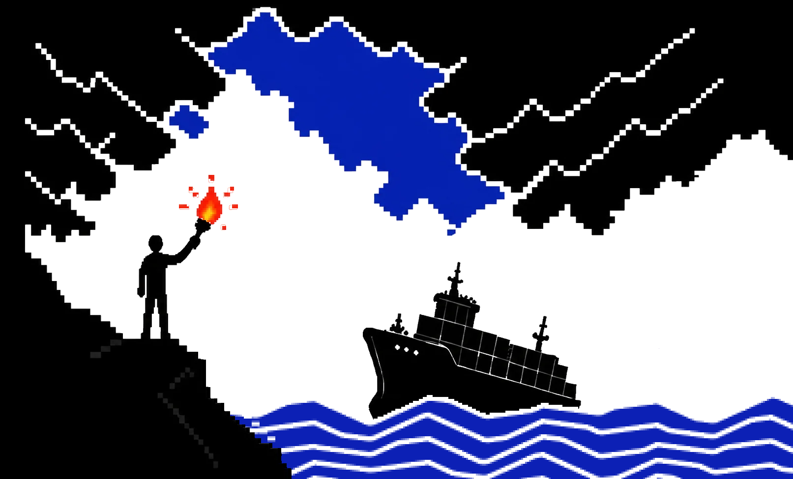
The harbor transition was difficult. I wanted the cliffs to move and grow as the page scrolled, gradually covering the water and lighthouse while the dark article section appeared below. Different layers needed to move together, but at different rates. I was specifying those relationships; the agent had to translate them into motion.
Several iterations got those relationships wrong. The cliffs scaled without moving far enough sideways. The text stayed visible too long. The lighthouse disappeared too early. The article appeared too late. Fixing one part could make another part more aggressive.
I had also asked for the wave layer to scale slightly during the transition. Eventually I dropped that request because it was hurting smoothness. It was an effect I had wanted, and the result gave me a reason to remove it.
The interactive sea went much better. I wanted mouse movement to disturb the waves and affect the ship. We chose a shader, worked through a small brief and built a separate version to try. My response was:
Great! Works really well.
There was an initial loading issue to fix, but I then asked to use it in the homepage hero.
That is a useful example of the collaboration working. The scene already existed. The desired behavior was bounded. I could try it and judge the result directly. We added something playful without reopening the entire design.
Taste was in the relationships
Looking back, my decisions weren't all about removing things.
I wanted expressive illustrations, interactive water and a dramatic transition. I also wanted a calm reading column, restrained article navigation, and sections that didn't all demand the same amount of attention.
Near the end, I complained that the top of the page looked like a “WHITE WALL.” The section below the hero was already working; the relationship between the sections needed contrast. We explored a compact strip rather than replacing the good section.
The About and contact sections had a similar problem. Too much white, followed by another text-left, image-right arrangement. A white About section above a stronger blue contact section gave the sequence more contrast.
I removed a shader effect from the marquee because it brought no value. But I kept refining the motion of the water. Those choices make sense together: one effect added little to its context; the other was part of what made the scene interesting.
A single rule like “use less decoration” would have missed most of the work. The question was what each part contributed, and how it changed the experience of the parts around it.
What carries into VSS
Generated images made exploration easier; Codex helped turn selected ideas into working interactions. But prompt quality, workflow discipline and implementation fidelity needed separate attention. That distinction is shaping VSS.
The next workflow needs to keep a few things explicit:
- What are we deciding at this step?
- Which parts have already been approved?
- What must survive unchanged?
- Are we reviewing an image, an asset, a layout or an implementation?
- Does the rendered result preserve the qualities that made us choose the reference?
I also need to make those boundaries clear in my own requests. “Four more” can mean four new directions or four variations of one section. Those are very different tasks.
By the end, the site contained a history of those decisions: a ship I wanted to play with, a lighthouse I wanted to keep, a section that needed room to breathe, and several ideas I was glad we abandoned. That is the part of the process I want to make easier to repeat.
TL;DR
When I decided to refresh my outdated personal website, I started experimenting with generated brand visuals to push beyond the generic website designs I was getting from AI. That led to VPES: a CLI-based authoring system combined with AI skills. It helped me to explore visual directions and build around the one I selected. The difficult part was carrying those decisions from images into assets, layouts and code. Human judgment shaped the direction, corrected the drift and decided which effects earned their place. Those lessons, alongside my prompt experiments and observations, are now shaping Visual System Skills. A skills system, based on carefully crafted prompts, and library of optional, helpful style directions.